Style & Context
Influences
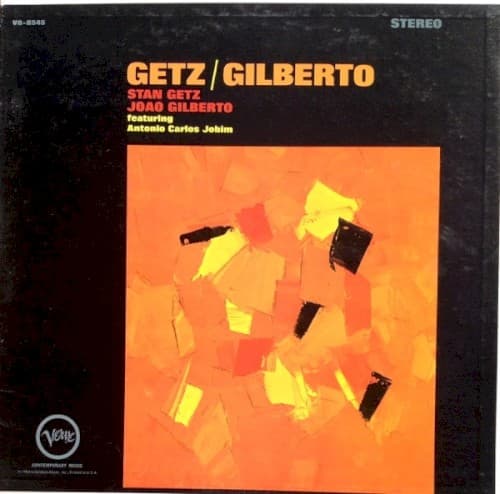
Mark Rothko, Franz Kline, mid-century modernist album design
Location
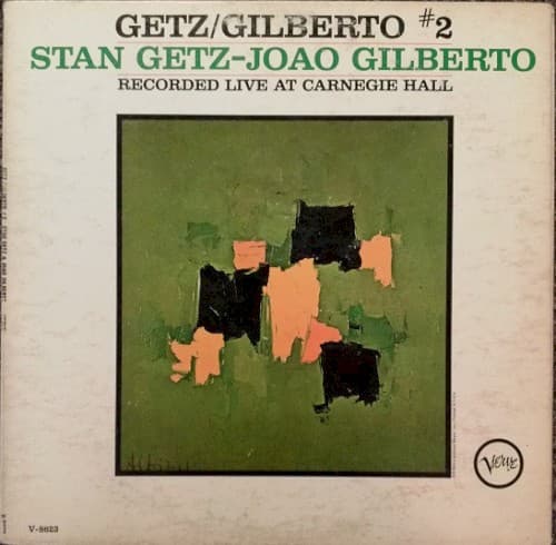
This follow-up to the massively successful first Getz/Gilberto album positions the collaboration as art rather than novelty.
Visual Language
The painterly abstraction rejects literal representation in favor of emotional geometry and color relationships.
Symbols
Black geometric shapes
These angular forms suggest the two musicians as abstract presences converging on Carnegie Hall's stage.
Coral rectangles
The warm coral tones represent Brazilian bossa nova heat interrupting American cool jazz restraint.
Central dark mass
This focal point marks where Getz's saxophone and Gilberto's guitar voices intertwine in performance.
Where Sound Meets Image
The abstract shapes mirror bossa nova's own abstraction of samba rhythms into something cooler and more spacious. Just as Gilberto's guitar patterns reduce samba to essential syncopations, these geometric forms reduce visual representation to essential relationships. The restraint in the color palette echoes the famous 'quiet' quality of both Getz's tenor tone and Gilberto's whispered vocals. The live Carnegie Hall setting meant improvisation and spontaneity, reflected in the seemingly spontaneous paint application and composition.
This cover represents the moment when jazz album art could assume audience sophistication—no need for literal imagery when the artists' names alone carried meaning. It influenced subsequent Verve releases that paired Brazilian music with abstract modernist visuals. The approach anticipated 1970s ECM Records' aesthetic of pairing European jazz with minimalist art, proving abstract design could convey musical emotion.