Style & Context
Influences
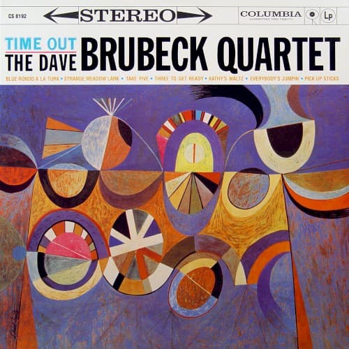
Bauhaus design principles, Kandinsky, mid-century American modernism, Japanese composition
Location
The design reflects West Coast jazz's embrace of formal innovation without alienating college-educated audiences.
Visual Language
Fujita's crisp geometric approach channels European modernism through a distinctly American commercial lens.
Symbols
Fragmented circular forms
Each bisected circle represents the unusual time signatures that define the album's character.
Radiating fan patterns
The starburst shapes visualize the expanding rhythmic possibilities Brubeck explored beyond standard meter.
Interlocking geometric segments
The puzzle-like assembly mirrors how drummer Joe Morello and bassist Eugene Wright locked complex patterns.
Where Sound Meets Image
The geometric fragmentation directly corresponds to how Brubeck and Paul Desmond broke standard 4/4 time into unconventional divisions. Take Five's famous 5/4 meter finds its visual equivalent in the asymmetrical circular segments that refuse to resolve into complete forms. The warm color palette contradicts the clinical reputation of odd-meter jazz, suggesting the playfulness audiences actually heard in Brubeck's approach. The overlapping transparent shapes echo the polyphonic interplay between Desmond's alto saxophone lines and Brubeck's piano voicings.
Fujita's cover established that complex jazz could be marketed through equally sophisticated visual language rather than photographs of musicians. His abstract approach influenced decades of Blue Note, Impulse, and ECM cover designs that trusted audiences to connect visual experimentation with sonic innovation. The design remains instantly recognizable, helping Time Out maintain cultural presence across seven decades and making it perhaps the most famous jazz album cover after Kind of Blue.