Style & Context
Influences
Modernist portraiture, fashion photography, documentary realism
Location
The studio formality reflects Riverside Records' campaign to position modern jazz as sophisticated art, not mere entertainment.
Visual Language
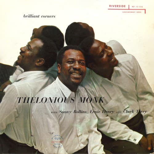
The tight framing and overlapping figures create visual rhythm that echoes Monk's syncopated piano voicings.
Symbols
Overlapping heads in profile
The physical convergence represents the album's complex polyphonic arrangements where individual voices interlock.
Monk's direct gaze amid profiles
His frontal position acknowledges leadership while the others' profiles suggest focused listening and ensemble democracy.
Shared smiles and laughter
Joy permeates the difficulty of the music, contradicting assumptions that angular bebop must be serious.
Where Sound Meets Image
The overlapping heads visualize the album's title track, where Monk's angular composition requires musicians to navigate brilliant corners together, each voice turning at unexpected moments. The laughter suggests the playful intelligence behind Monk's dissonant chords and odd phrase lengths. Sonny Rollins, Ernie Henry, and Clark Terry crowd the frame just as their horns crowd Monk's sparse piano spaces on the recording, creating density through collective effort rather than individual virtuosity.
This cover helped establish Riverside's house style of intimate group portraits that humanized bebop innovators. The direct emotional engagement influenced Blue Note's later candid session photography and countered abstract modernist covers prevalent in 1950s jazz. Decades later, hip-hop producers sampling Monk would reference this image's balance of formality and authentic joy.