Style & Context
Influences
Hans Hofmann, Stuart Davis, Brazilian modernist abstraction
Location
Verve Records positioned this album for both jazz purists and pop listeners seeking exotic sophistication during the early 1960s jet-set era.
Visual Language
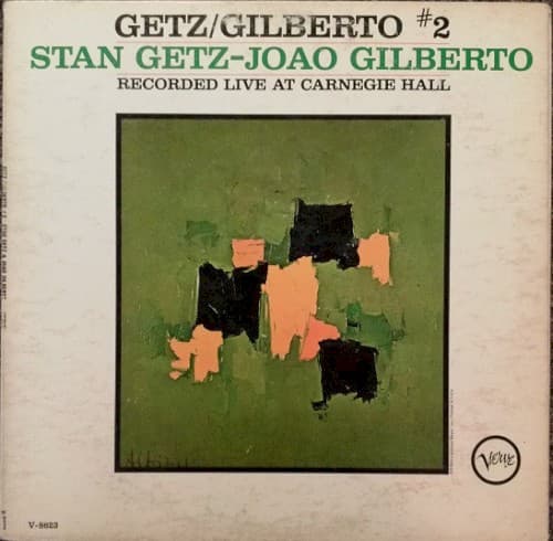
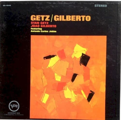
The composition borrows from New York school gestural painting while maintaining the accessible warmth that Verve covers required for commercial success.
Symbols
Floating brown rectangles
These tilted shapes represent the syncopated rhythms of samba reorganized into bossa nova's subtle swing.
Yellow directional shapes
The arrow-like forms pointing in multiple directions mirror the album's cross-cultural dialogue between American and Brazilian jazz.
Orange gradient field
The unified background suggests how Getz's tenor merged seamlessly with Gilberto's intimate guitar and vocals.
Where Sound Meets Image
The scattered shapes visually translate João Gilberto's revolutionary guitar technique, where rhythm and melody fragment into whispered syncopations. The warm palette matches the album's intimate vocal performances, especially Astrud Gilberto's untrained delivery on 'The Girl from Ipanema,' which sounds like sunlight made audible. The composition's negative space mirrors the cool jazz restraint Getz brought to samba rhythms, creating visual breathing room that echoes the music's relaxed sophistication.
This cover helped establish that jazz album art could use pure abstraction to communicate genre and mood without literal representation. The design influenced how later Latin jazz releases balanced cultural specificity with modernist aesthetics, proving that geometric abstraction could feel both sophisticated and accessible. Decades later, the orange field remains instantly recognizable, having become visual shorthand for bossa nova's crossover moment in American culture.