Style & Context
Influences
Corporate portraiture, Blue Note's Francis Wolff, mid-century advertising photography
Location
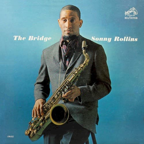
The studio setting deliberately avoids geographic markers, presenting Rollins as a universal artist rather than scene participant.
Visual Language
The formal composition borrows from executive portrait conventions, elevating the jazz musician to professional respectability status.
Symbols
Houndstooth jacket
The textured pattern suggests complexity and sophistication, mirroring the harmonic density of his post-sabbatical playing.
Direct eye contact
Rollins meets the viewer's gaze with quiet assurance, signaling his readiness to re-enter the competitive jazz scene.
Saxophone held close
The intimate grip on his instrument reveals an unbreakable bond forged during countless solitary hours on the bridge.
Where Sound Meets Image
The composed, centered portrait mirrors the album's measured approach to hard bop and modal exploration. After his bridge sabbatical, Rollins returned with guitarist Jim Hall, creating chamber-like intimacy rather than aggressive blowing sessions. The cover's restraint reflects this new aesthetic direction—thoughtful, spacious, architecturally sound. The title track's structure literally references the bridge where he woodshedded, making the formal presentation a statement about discipline and craft rather than spontaneous expression.
This cover helped establish the template for comeback albums, presenting artistic renewal through visual dignity rather than novelty. The straightforward portrait approach influenced how labels would later market returning legends, from Coltrane to Shorter. Its refusal of gimmickry—no abstract art, no action shots—declared that Rollins's music required no visual tricks to command attention, a confidence that remains instructive for jazz packaging.