Style & Context
Influences
Film noir, modernist graphic design, Blue Note aesthetics
Location
Released when Harlem and the Village were asserting jazz as American classical music, not background soundtracks.
Visual Language
The stark photographic technique borrows from cinema's dramatic lighting while anticipating minimalist album design trends.
Symbols
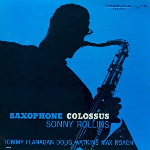
Complete silhouette treatment
Rollins becomes an everyman hero, the saxophonist as universal archetype rather than individual personality.
Cropped composition at shoulders
The tight framing creates claustrophobic intensity, mirroring the album's focused thematic improvisations.
Saxophone positioned upward
The horn's angle suggests aspiration and the hard bop generation's reach toward serious art status.
Where Sound Meets Image
The cover's dramatic minimalism perfectly captures the album's bold thematic approach, where Rollins builds extended improvisations on simple structures like 'St. Thomas' calypso groove and 'Blue 7' blues. The silhouette's anonymity mirrors how Rollins dissolves his identity into pure musical exploration, while the stark contrast reflects the album's sharp interplay between melody and rhythm. The cropped, intense framing matches the music's disciplined intensity—four musicians creating maximum expression through focused restraint.
This cover established the silhouette as shorthand for jazz seriousness, influencing decades of album art that prioritized mystery over personality. The electric blue background became synonymous with Prestige's hard bop catalog and influenced the label's visual identity through the late 1950s. The minimalist approach anticipated 1960s Blue Note designs while proving that simple photographic concepts could convey musical sophistication without illustration or portraiture.