Style & Context
Influences
Kandinsky, Paul Klee, Bauhaus geometric abstraction, African textile patterns
Location
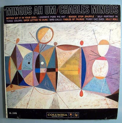
This cover speaks the visual language of New York's avant-garde gallery scene translating Mingus's Lower East Side intensity.
Visual Language
The style merges European modernist geometry with an organic warmth that suggests vernacular Black art traditions.
Symbols
Fractured geometric shapes
The splintered triangles and polygons represent the fragmented American promise that Mingus confronted in protest works.
Orange and red circles
These orbs echo the warmth of gospel churches while floating above the geometric chaos like spiritual anchors.
Purple and blue triangular forms
The cool angular shapes suggest the intellectual rigor Mingus brought to dismantling harmonic and social structures.
Where Sound Meets Image
The geometric fragmentation directly mirrors Mingus's compositional technique of layering multiple rhythms, tempos, and emotional states within single pieces. The warm circles floating above angular chaos visualize how gospel-influenced melodies in 'Better Git It in Your Soul' soar above complex polyrhythmic foundations. The color palette's refusal to resolve into harmony parallels 'Fables of Faubus,' where beauty and rage coexist without reconciliation. The beige background suggests the blues and folk traditions Mingus drew from, while the modernist shapes acknowledge his formal innovations.
This cover helped establish abstract art as the visual language for intellectually ambitious jazz, influencing how labels like Blue Note and Impulse would package avant-garde recordings throughout the 1960s. The geometric approach became shorthand for complexity and seriousness, separating art jazz from commercial releases featuring performer photographs. Decades later, the design remains striking because it trusted viewers to engage with visual complexity rather than offering easy answers.