Style & Context
Influences
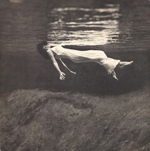
Toni Frissell's underwater fashion work, existentialist European cinema, Abstract Expressionism
Location
The image reflects Greenwich Village's intellectual jazz scene where Evans performed at the Vanguard.
Visual Language
The photographic approach treats the human form as sculptural element within liquid space geometry.
Symbols
Submerged figure
The body suspended underwater represents the introspective descent required for genuine musical conversation.
Flowing white garment
The fabric's weightless drift suggests the fluid exchange between Evans' piano and Hall's guitar.
Refracted surface light
Fractured illumination symbolizes how musical ideas transform when passing between two sensitive improvisers.
Where Sound Meets Image
The suspended weightlessness perfectly captures the album's conversational delicacy between Evans and Hall, two musicians who listen as much as they play. The water's natural reverb visually represents the spacious interplay heard in 'Romain' and 'My Funny Valentine,' where silence functions as third voice. The monochromatic treatment mirrors the duo format's timbral restraint, while the figure's isolation reflects chamber jazz's rejection of rhythm section foundations.
This cover helped establish underwater photography as metaphor for jazz introspection, influencing subsequent album art that used aquatic imagery to suggest emotional depth. The design demonstrated that post-bop packaging could appeal to art photography collectors, expanding jazz's audience beyond nightclub regulars. Its success validated abstract conceptual approaches over literal performance documentation.