Style & Context
Influences
Reid Miles minimalism, New Wave cinema posters, Andy Warhol repetition
Location
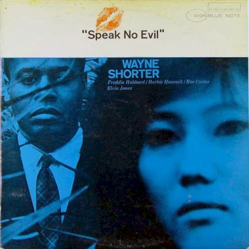
The fragmented faces reflect the psychological complexity emerging in post-bop composition as the civil rights movement intensified.
Visual Language
The overlapping exposures create depth through transparency rather than perspective, a visual analogue to modal layering.
Symbols
Overlapping faces
The merged portraits suggest the dual nature of consciousness that jazz improvisation reveals in real time.
Orange lips seal
The stamp functions as both censorship mark and invitation, embodying the album's title paradox perfectly.
Suited figure
The formal attire against bare vulnerability creates tension between public persona and private musical truth.
Where Sound Meets Image
The overlapping transparent faces visualize how Shorter's compositions layer melodic cells over shifting modal centers, creating harmonic ambiguity that demands active listening. The cold blue palette matches the album's restrained intensity—this is cerebral hard bop that thinks before it shouts. The 'speak no evil' lips stamp connects directly to the album's exploration of moral witness and silence, themes Shorter would explore through compositions addressing social tension without explicit protest, letting musical tension speak what words cannot.
Reid Miles' design for Blue Note established that modal jazz deserved visual complexity matching its harmonic sophistication, influencing decades of independent label aesthetics that favored mystery over explanation. The duotone face treatment became shorthand for serious, introspective jazz—copied endlessly but rarely with this much psychological weight. Contemporary reissues preserve the design because it has become inseparable from the music's meaning.