Style & Context
Influences
Film noir cinematography, documentary realism, French New Wave portraiture
Location
This shooting style reflects Harlem and Village jazz clubs' dim, smoke-filled atmosphere where music demanded concentrated listening.
Visual Language
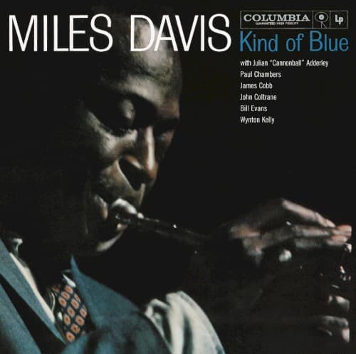
The dramatic side-lighting and deep shadows borrow directly from 1940s crime cinema's visual language.
Symbols
Upward trumpet angle
The horn points skyward but stays silent, suggesting contemplation rather than performance itself.
Shadow-obscured face
Half of Davis's features disappear into darkness, embodying modal jazz's emphasis on space over notes.
Low camera perspective
Shooting from below elevates Davis to monumental status without traditional portraiture's formality or distance.
Where Sound Meets Image
The cover's emphasis on negative space—the vast blackness surrounding Davis—directly parallels the revolutionary use of space in tracks like 'So What' and 'Flamenco Sketches.' Where bebop filled every measure with notes, Kind of Blue breathed. The photograph's stillness captures this aesthetic shift. The contemplative, upward-gazing pose suggests the album's balladic quality, particularly 'Blue in Green,' while the dramatic lighting hints at the emotional depth beneath the cool surface. The image promises exactly what the album delivers: restrained intensity and meditative power.
This cover established the template for countless jazz albums: the solitary artist in dramatic lighting, instrument held but not played, gaze averted from the viewer. Blue Note would refine the approach throughout the 1960s, but Columbia's Kind of Blue cover proved that serious jazz deserved serious visual treatment. The design's restraint—no attempt to illustrate the music, no colorful abstraction—let the photograph carry full weight, influencing how jazz presented itself for decades.