Style & Context
Influences
documentary realism, religious portraiture, mid-century modernist design
Location
This cover emerged from Impulse Records' sophisticated visual language targeting educated jazz listeners seeking transcendence.
Visual Language
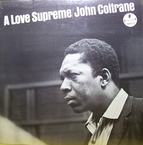
The photographic approach favors directness over artifice, treating Coltrane as both artist and spiritual messenger.
Symbols
Downward gaze
Coltrane looks inward and downward, visualizing the humble submission central to his four-part prayer suite.
Profile positioning
The side view suggests we're witnessing a private moment of devotion not meant for direct audience engagement.
Crisp white collar
The formal collar evokes pulpit dress and Sunday reverence, connecting jazz to Black church tradition.
Where Sound Meets Image
The visual austerity mirrors the suite's structure—four movements built from simple motifs that accumulate profound spiritual weight through repetition and intensity. Coltrane's closed-off posture reflects the album's turning away from secular concerns toward complete devotion, just as the title track's famous four-note 'A Love Supreme' theme builds from humble simplicity to overwhelming power. The photograph's stillness contrasts with the music's ecstatic energy, capturing the moment before Coltrane inhales to blow—the silence that makes the prayer possible.
This cover established the visual vocabulary for spiritual jazz—minimal design, contemplative poses, monochrome dignity over flashy color. Its influence appears in countless ECM releases and in how jazz musicians photograph themselves when addressing serious themes. The design proved that less could communicate more, that empty space could hold as much meaning as ornate illustration, and that a single honest photograph could match the depth of the music it represented.