Style & Context
Influences
Bauhaus minimalism, Blue Note modernism, passport photography
Location
This aesthetic emerged from New York's downtown scene where bebop formalism met avant-garde experimentation.
Visual Language
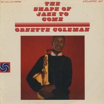
The unadorned approach strips away jazz marketing clichés to present Coleman as serious artist-thinker.
Symbols
Direct eye contact
Coleman's unflinching gaze challenges listeners to confront free jazz on his terms without apology.
Centered composition
The perfectly centered framing positions Coleman as the absolute focal point of the revolution.
Black turtleneck sweater
The intellectual's uniform connects Coleman to beatnik culture and serious artistic discourse beyond entertainment.
Where Sound Meets Image
The cover's confrontational minimalism mirrors the album's stripping away of conventional chord changes and fixed harmonic centers. Just as the red background provides no visual reference points, Coleman's harmolodic approach removes traditional tonal anchors. The static portrait contrasts sharply with the music's wild energy, creating the same productive tension found between Coleman's compositions and their improvisational execution. The formal presentation dignifies music that many 1959 listeners heard as chaotic.
This cover established the visual template for presenting avant-garde jazz as serious artistic statement rather than popular entertainment. Its influence appears in countless minimalist jazz portraits from ESP-Disk to ECM Records. The decision to let Coleman's face and instrument carry the entire visual weight inspired photographers to trust simple portraiture for complex music, proving that radical sounds didn't require elaborate visual metaphors.