Style & Context
Influences
Swiss modernism, urban signage, mid-century advertising minimalism
Location
The sparse elegance mirrors Manhattan's transformation into a modernist city of glass, steel, and geometric ambition.
Visual Language
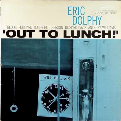
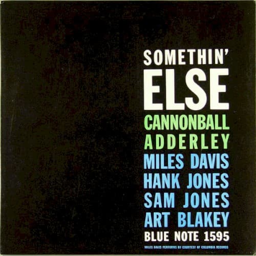
Reid Miles stripped jazz cover design to pure information, letting type express the music's architectural clarity.
Symbols
Mottled black texture
The weathered darkness mirrors the lived-in warmth of Rudy Van Gelder's Hackensack studio walls.
Color-coded artist names
Each musician gets a distinct hue like separate instrumental voices in a carefully arranged ensemble.
ALL-CAPS sans-serif type
The bold lettering reflects hard bop's confident urban energy and Blue Note's modernist aesthetic.
Where Sound Meets Image
The visual restraint mirrors the album's cool sophistication where hard bop muscularity meets lyrical restraint. The color separation of artist names reflects how each player—Miles' muted introspection, Adderley's alto warmth, Jones brothers' rhythmic architecture—maintains distinct identity within tight ensemble arrangements. The darkness surrounding the text suggests the intimate after-hours atmosphere where 'Autumn Leaves' and 'Love For Sale' unfold with conversational ease rather than showboating virtuosity.
This typography-forward approach became Blue Note's signature visual language through hundreds of releases, proving jazz album covers could sell sophistication through restraint rather than spectacle. The template influenced countless labels seeking to communicate artistic seriousness, making the simple text-on-texture formula synonymous with premium recorded jazz.