Style & Context
Influences
Robert Frank, Henri Cartier-Bresson, Blue Note house style
Location
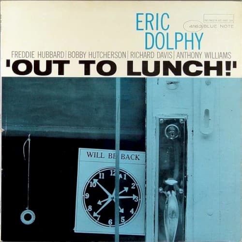
The anonymous storefront could be any American city block where jazz musicians actually took lunch breaks between sessions.
Visual Language
The documentary approach elevates mundane urban architecture into surrealist commentary on modern alienation.
Symbols
Clock showing 2:30
Time appears fractured and unreliable, reflecting how Dolphy dismantled conventional jazz time signatures.
'Will Be Back' sign
The promised return never comes, echoing the album's refusal to resolve into expected harmonic patterns.
Empty doorway void
The black rectangular space represents the silences and negative space Dolphy used as compositional elements.
Where Sound Meets Image
The clock's precise hands contrast with the album's temporal elasticity, where Dolphy and his quintet stretch and compress time across tracks like 'Hat and Beard' and 'Gazzelloni.' The empty storefront parallels the sparse, angular compositions that leave breathing room between notes. The 'Will Be Back' sign's broken promise mirrors how the title track never returns to its stated themes, constantly pivoting into unexpected territories. The photograph's mundane subject elevated through artistic treatment parallels Dolphy's transformation of familiar jazz vocabulary into something startlingly new.
This cover established that jazz album art could embrace conceptual wit rather than musician portraiture or abstract expressionism. The photograph's deadpan humor influenced decades of alternative jazz packaging, from ECM's austere landscapes to contemporary experimental labels. Its success proved that Blue Note could sell challenging music through equally challenging visuals, trusting audiences to appreciate the intellectual play between image and sound.