Style & Context
Influences
Documentary photography, William Claxton's West Coast jazz portraiture, French New Wave cinema
Location
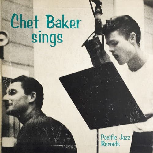
This cover reflects the Los Angeles studio scene's preference for introspection over New York's competitive virtuosity.
Visual Language
The candid framing suggests Baker was photographed during an actual session, not posed for promotional purposes.
Symbols
Sheet music in hand
Baker's vocal work required the same careful study as his trumpet playing, legitimizing his singing career.
Downward gaze
The introspective angle captures the vulnerability that made Baker's voice so affecting and emotionally direct.
Second figure in shadow
The blurred accompanist emphasizes Baker's isolation and the solitary nature of vocal jazz interpretation.
Where Sound Meets Image
The visual restraint matches Baker's fragile, behind-the-beat phrasing on ballads like 'My Funny Valentine' and 'But Not For Me.' His downcast eyes mirror the melancholic introspection of his vocal interpretations, which stripped standards down to their emotional core. The sheet music suggests Baker approached singing with the same discipline he brought to trumpet, yet the casual studio setting captures the spontaneous intimacy that made tracks like 'I Fall in Love Too Easily' feel like overheard confessions rather than performances.
This cover established the template for photographing jazz vocalists as serious artists rather than entertainers, influencing how labels presented everyone from Mark Murphy to Stacey Kent. The minimalist aesthetic became Pacific Jazz's signature, proving that understated design could communicate sophistication more effectively than elaborate illustrations. Decades later, indie labels still reference this stripped-down, in-the-studio approach when marketing intimate vocal projects.