Style & Context
Influences
Funk album surrealism, R&B portraiture, contemporary art photography, Erykah Badu's visual aesthetic
Location
This visual emerged from Los Angeles's Brainfeeder scene where musicians explored vulnerability and mental health openly.
Visual Language
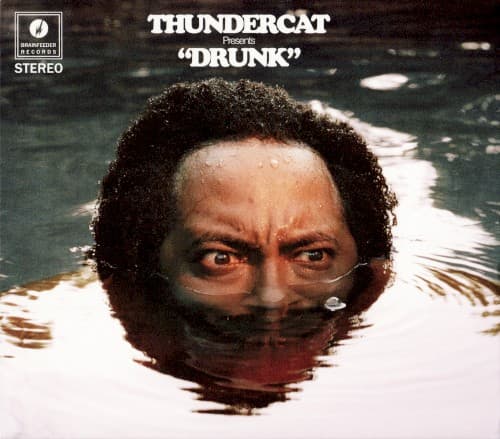
The photographic approach uses actual water rather than digital effects to achieve authentic optical distortion.
Symbols
Water at eye level
The liquid line bisecting his face represents the threshold between sobriety and intoxication, reality and escape.
Direct eye contact
His intense gaze confronts viewers despite submersion, suggesting awareness persists even in altered states.
Partial submersion
Only half the face visible mirrors how drunk people exist between two worlds simultaneously.
Where Sound Meets Image
The half-submerged perspective mirrors the album's sonic architecture where funk basslines float beneath hazy vocals and jazz harmonies ripple across R&B grooves. Thundercat's lyrics explore drinking as both escape and trap, and the water simultaneously suggests cleansing and drowning. The direct eye contact maintains human connection even as the music drifts through intoxicated landscapes, matching songs that balance humor with genuine pain. Water's distortion effect parallels how the album warps familiar funk and fusion elements into something beautifully disorienting.
This cover helped establish visual language for millennial jazz artists addressing mental health and substance use without glamorization or shame. The simple yet psychologically complex portrait influenced how contemporary fusion musicians present vulnerability in promotional imagery. Its success demonstrated that jazz-adjacent albums could use stark, confrontational visuals rather than abstract or nostalgic imagery while maintaining artistic credibility.