Style & Context
Influences
Rock poster art, Blue Note photography, underground newspaper graphics
Location
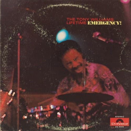
The psychedelic color treatment bridges jazz clubs and rock venues where fusion would eventually thrive.
Visual Language
The photographer captured Williams working his kit then drenched the image in acid-rock hues.
Symbols
Distressed border texture
The deteriorating frame represents jazz tradition fragmenting under the pressure of amplification and innovation.
Floating colored orbs
These abstract light forms suggest the unpredictable energy particles released when jazz fuses with rock electricity.
Williams mid-performance blur
The slight motion in his figure captures the unstoppable momentum driving this new music forward relentlessly.
Where Sound Meets Image
The visual chaos perfectly mirrors the album's collision of John McLaughlin's overdriven guitar, Larry Young's swirling organ, and Williams's polyrhythmic assault. The electric blue and magenta aren't decorative—they're visual analogues for the sustained distortion and modal ambiguity throughout tracks like 'Emergency!' The motion blur captures how this trio refused to settle into predictable grooves, constantly shifting tempos and textures. Just as the cover makes you unsure where to focus your eye, the music destabilizes your rhythmic expectations constantly.
This cover established visual vocabulary for fusion: live performance energy plus psychedelic color manipulation equals new music requiring new visual language. It influenced how labels would market fusion throughout the seventies—emphasizing electricity, youth energy, and cross-genre boundary violation. The template appears in later Mahavishnu Orchestra and Return to Forever covers where jazz photography gets rock treatment.