Style & Context
Influences
Abstract Expressionism, Franz Kline, Japanese calligraphy, Cy Twombly
Location
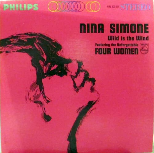
This cover emerged when Simone was becoming increasingly politically outspoken after the Birmingham church bombing.
Visual Language
The violent spontaneity of the brushwork channels action painting's emotional immediacy into portraiture.
Symbols
Dissolving facial features
Simone's identity transcends fixed representation, existing in constant transformation and defiance.
Downward brushstroke movement
The descending gestures suggest tears, rain, or the weight of emotional truth bearing down.
Incomplete profile outline
The fragmentary silhouette represents a performer who refused to be fully captured or contained.
Where Sound Meets Image
The gestural violence of the brushwork perfectly embodies the album's title track, where Simone's voice becomes a natural force—unpredictable, powerful, impossible to contain. The downward motion of the strokes mirrors the melancholic descent in ballads like 'I Love Your Lovin' Ways,' while the fragmentary quality reflects how 'Four Women' dissects Black female identity into painful archetypes. The pink background's sweetness corrupted by black aggression parallels Simone's ability to take romantic standards and infuse them with barely suppressed rage.
This cover helped establish abstract expressionist portraiture as a legitimate approach for jazz packaging, influencing later vocal jazz covers that prioritized emotional essence over literal representation. The gendered color subversion—using pink aggressively rather than delicately—anticipated feminist art movements of the 1970s. Contemporary designers still reference this tension between soft backgrounds and harsh mark-making when depicting powerful female vocalists who refuse categorization.