Style & Context
Influences
Broadway playbill design, film noir portraiture, European chanson album aesthetic
Location
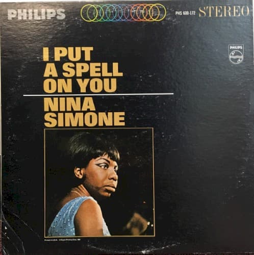
This Philips release targeted upscale international markets, positioning Simone as sophisticated chanteuse rather than blues singer.
Visual Language
The high-contrast lighting and minimal staging recall European art photography more than typical American jazz packaging.
Symbols
Profile positioning
Simone refuses to face the camera directly, asserting control over how she is seen and consumed.
Bare shoulders
The sleeveless dress suggests vulnerability while her posture communicates absolute strength and self-possession.
Yellow title treatment
The oversized golden letters function like a marquee, positioning Simone as headliner and star.
Where Sound Meets Image
The cover's confrontational intimacy mirrors Simone's approach to the title track and standards throughout the album. Her profile positioning reflects how she transforms familiar songs like 'Ne Me Quitte Pas' and 'Feeling Good' by viewing them from unexpected angles, refusing to deliver them straight. The theatrical lighting suggests the smoky cabaret atmosphere where Simone performed these pieces with volcanic emotional intensity. The minimal staging puts complete focus on her presence, just as the album's stripped arrangements let her voice and piano dominate.
This cover established a visual template for presenting powerful Black female vocalists as serious artists rather than entertainers. The stark, confrontational portrait style influenced countless jazz and soul album covers through the 1970s, particularly for artists like Roberta Flack and Abbey Lincoln who demanded similar artistic respect. The theatrical darkness and profile positioning became shorthand for sophisticated vocal jazz with emotional depth.