Style & Context
Influences
Reid Miles, Swiss International Style, modernist jazz photography
Location
The street-level aesthetic connects to Harlem and Philadelphia's working-class soul jazz scenes where boogaloo was born.
Visual Language
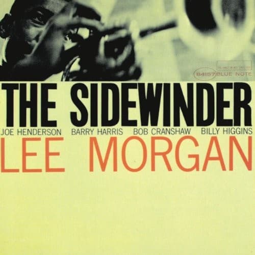
The high-contrast photography combined with oversized typography follows Reid Miles' Blue Note aesthetic revolution of the early 1960s.
Symbols
Trumpet player in shadow
The musician's face obscured by shadow and instrument emphasizes craft over celebrity, pure sound over personality.
Split composition layout
The divided frame reflects soul jazz's tension between underground authenticity and mainstream commercial appeal.
Bold sans-serif typography
The aggressive type treatment mirrors the album's direct, groove-forward approach to hard bop conventions.
Where Sound Meets Image
The cover's stark contrasts mirror the album's blend of sophisticated modal jazz and earthy boogaloo rhythms. The bold typography reflects the title track's unforgettable riff, as direct and memorable as the massive letterforms. The split between dark photography and bright background captures the tension between Morgan's bluesy accessibility and his technical mastery, the same duality that made 'The Sidewinder' both a Top 25 pop hit and a jazz standard. The street-level perspective connects to the album's roots in Philadelphia's Black working-class dance culture.
This cover established a template for jazz marketing in the crossover era, proving sophisticated design could attract mainstream audiences without diluting artistic content. Reid Miles' approach here influenced decades of Blue Note releases that balanced commercial appeal with creative integrity. The design's success helped save Blue Note financially, demonstrating that thoughtful visual presentation could expand jazz's audience during rock's dominance.