Style & Context
Influences
Blue Note era portraiture, contemporary fashion photography, film noir aesthetics
Location
The fashion-forward styling speaks to urban coffee shop culture and NPR audiences rediscovering jazz through accessible collaborations.
Visual Language
The tight crop and directional lighting create sculptural dimensionality, treating Hancock's profile like carved stone in museum light.
Symbols
Aviator sunglasses
The reflective lenses create a barrier, positioning Hancock as listener translating another artist's vision rather than performing ego.
Downward gaze
His eyes hidden and head tilted downward suggest humility before the source material, honoring Mitchell's original compositions.
Wrapped scarf
The intricate purple textile recalls both African textiles and bohemian artistry, bridging Hancock's roots with Mitchell's folk influences.
Where Sound Meets Image
The averted gaze and shadowed face reflect how these arrangements approach Mitchell's songs obliquely—Hancock never imitates her piano style but instead creates new harmonic pathways through familiar melodies. The wrapped scarf's intricate folds mirror the complex chord voicings that reimagine folk-rock as post-bop exploration. The cool blue palette matches the album's restrained dynamics, where Norah Jones and others sing with hushed intimacy over Hancock's crystalline piano clusters. This isn't bombastic fusion—it's chamber jazz, and the cover's quiet sophistication promises exactly that refined experience.
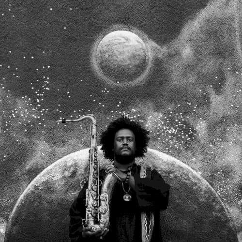
This cover helped redefine how heritage jazz artists could present contemporary projects without appearing dated. The fashion-conscious styling and modern typography influenced subsequent Verve releases seeking adult alternative audiences. Its success—the album won Album of the Year at the Grammys—proved jazz packaging could compete in mainstream retail without clichéd instruments-and-smoke imagery, paving the way for Kamasi Washington and Robert Glasper's visually progressive designs.