Style & Context
Influences
Reid Miles, Francis Wolff photography, mid-century modernism, maritime imagery
Location
This cover emerged when Blue Note was defining modern jazz's visual language through bold color fields and stark photography.
Visual Language
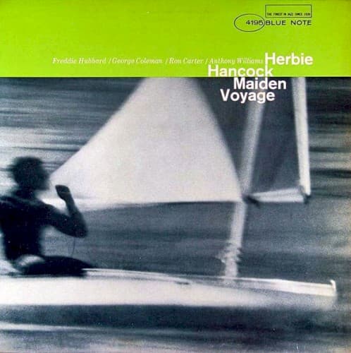
The calculated motion blur transforms documentary photography into impressionistic art, reflecting modal jazz's emphasis on mood over rigid structure.
Symbols
Blurred sailboat
The motion blur symbolizes jazz improvisation's fluid, ever-changing nature and the journey metaphor central to modal exploration.
Lone sailor figure
The solitary silhouette represents the individual voice within the ensemble, each musician navigating their own harmonic course.
White triangular sail
The geometric sail shape mirrors the clean, architectural quality of modal jazz's open harmonic structures and spacious arrangements.
Where Sound Meets Image
The blurred motion perfectly mirrors the album's flowing, waterlike modal compositions including the title track's oceanic swells and 'Eye of the Hurricane's' circular harmonic movement. The cover's spaciousness reflects Hancock's sparse comping style and the quintet's emphasis on atmosphere over density. That lime green burst suggests the optimism and adventure in Hancock's compositions, which used maritime titles as metaphors for harmonic exploration, with each musician navigating by the stars of modal centers rather than bebop's dense chord changes.
This cover established maritime imagery as shorthand for modal jazz exploration and influenced countless album designs pairing bold color fields with atmospheric photography. The deliberate blur technique became a visual language for representing improvisational fluidity, copied by designers seeking to visualize spontaneous creativity. Blue Note's house style reached its apex here, proving that album art could function as visual jazz criticism, interpreting music through design choices rather than merely decorating it.