Style & Context
Influences
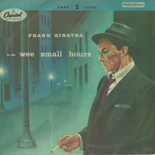
Edward Hopper, film noir cinematography, New York School painting
Location
This captures postwar American urban loneliness before rock and roll optimism took over popular music completely.
Visual Language
The painterly approach softens photographic realism into emotional impression, allowing mood to override documentary accuracy in service of feeling.
Symbols
Cigarette in hand
The burning cigarette represents both the passage of time during sleepless nights and the slow consumption of regret.
Empty street lamp
The solitary lamp post illuminates nothing but absence, visualizing how memory lights up what is no longer there.
Profile pose
Sinatra faces away from the viewer, refusing eye contact just as the heartbroken refuse to confront their pain directly.
Where Sound Meets Image
The deserted nocturnal cityscape perfectly mirrors the album's collection of ballads about insomnia and lost love. The blue wash evokes the orchestral arrangements that Nelson Riddle crafted as emotional environments rather than mere backdrops. Sinatra's averted gaze matches his vocal approach on these tracks—intimate confessions sung as if the listener has accidentally overheard them. The cigarette smoke drifting upward parallels the way his voice trails off at phrase endings, suggesting thoughts too painful to complete.
This cover established the visual vocabulary for lonely crooner albums and influenced decades of torch song packaging. The combination of urban nightscape and solitary figure became shorthand for sophisticated heartbreak. Blue became the default color for sad jazz vocals. The painting-from-photo technique anticipated countless album covers that blurred illustration and photography to create emotional rather than literal reality.