Style & Context
Influences
Japanese minimalism, Scandinavian design, nature photography
Location
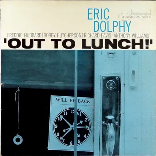
This European label aesthetic directly challenged Blue Note's urban grit and CTI's glossy commercialism with monastic restraint.
Visual Language
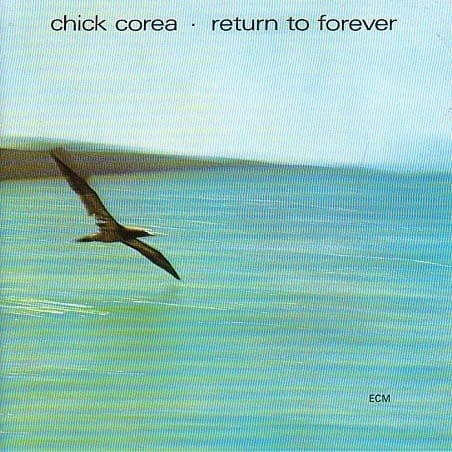
The image employs negative space as a compositional force, letting emptiness define form in exactly the way Corea's piano does on the recording.
Symbols
Solo seabird
The bird represents the musician's journey toward freedom through improvisation and flight.
Horizontal bands
These layered strata symbolize the modal music's harmonic plateaus and shifting tonal centers.
Minimalist composition
The sparse visual field mirrors ECM's aesthetic of space as sound, silence as structure.
Where Sound Meets Image
The seabird's solitary journey mirrors the quartet's exploration of Flora Purim's wordless vocals soaring over Airto Moreira's Brazilian percussion. The aquatic palette reflects Stanley Clarke's fluid bass lines and Corea's rippling electric piano cascades on tracks like 'What Game Shall We Play Today.' The horizontal bands suggest the modal vamps that characterize the album—static harmony as launching pad rather than destination. Just as the bird inhabits空間 between sea and sky, the music floats between structured Latin grooves and free-floating improvisation.
This cover established ECM's visual vocabulary for two decades: nature photography, muted palettes, philosophical distance. It taught jazz listeners that album art could whisper rather than shout. Countless ECM releases would follow this template—solitary figures in vast landscapes, always suggesting music as meditation. The cover influenced how fusion could be marketed as art music rather than commercial product, giving Corea's group intellectual credibility while maintaining accessibility.